Mobile App Design
The mobile application is designed to simplify the process of enrolling in and updating benefits for clients. The app allows users to manage a variety of benefits, including health and dental care, Health Care Spending Wellness Account, RRSP, Life Insurance, Critical Illness plan, Employee Share plan, and beneficiary information. With the help of this app, clients can easily keep track of their benefits and make updates as needed, all from the convenience of their mobile devices.

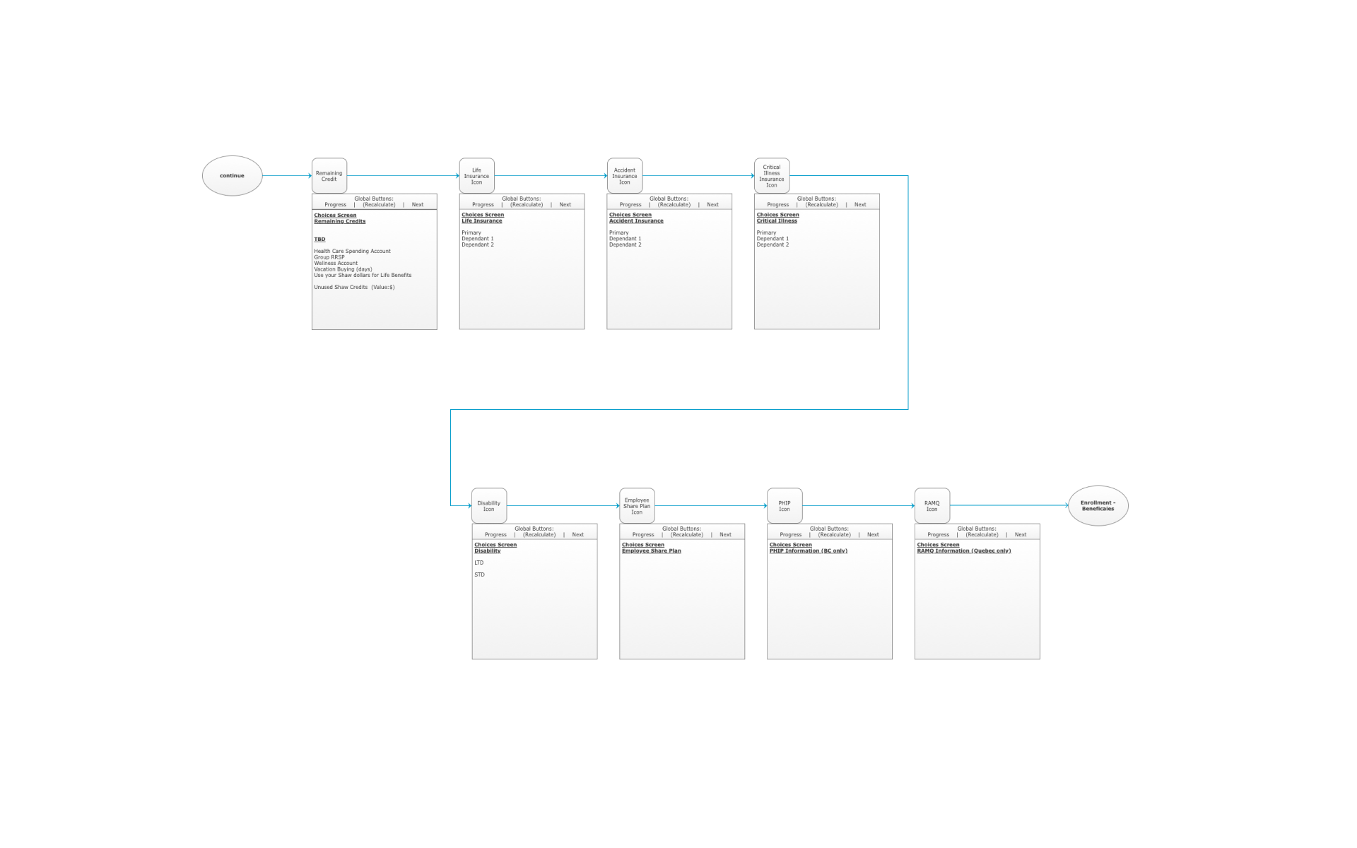
A Step-by-Step Flow Diagram
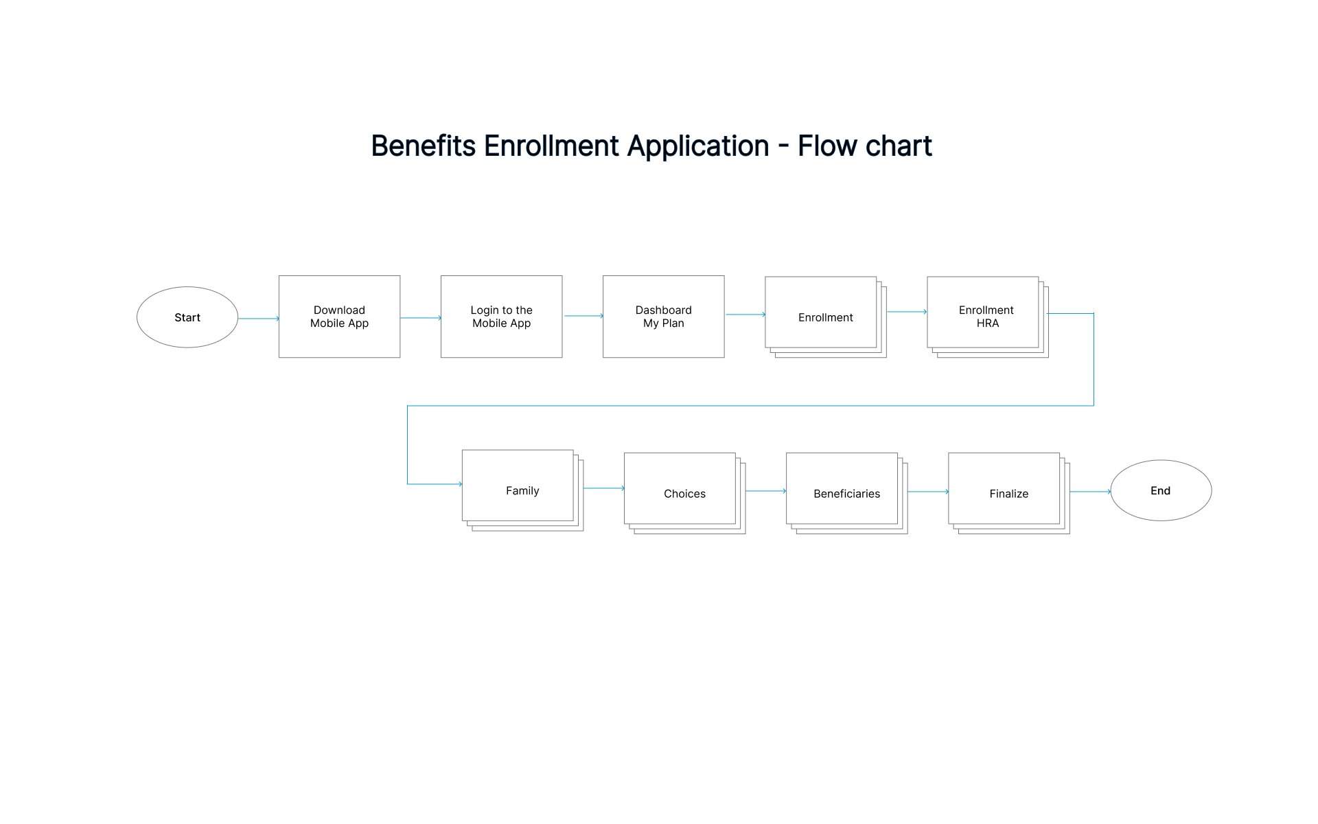
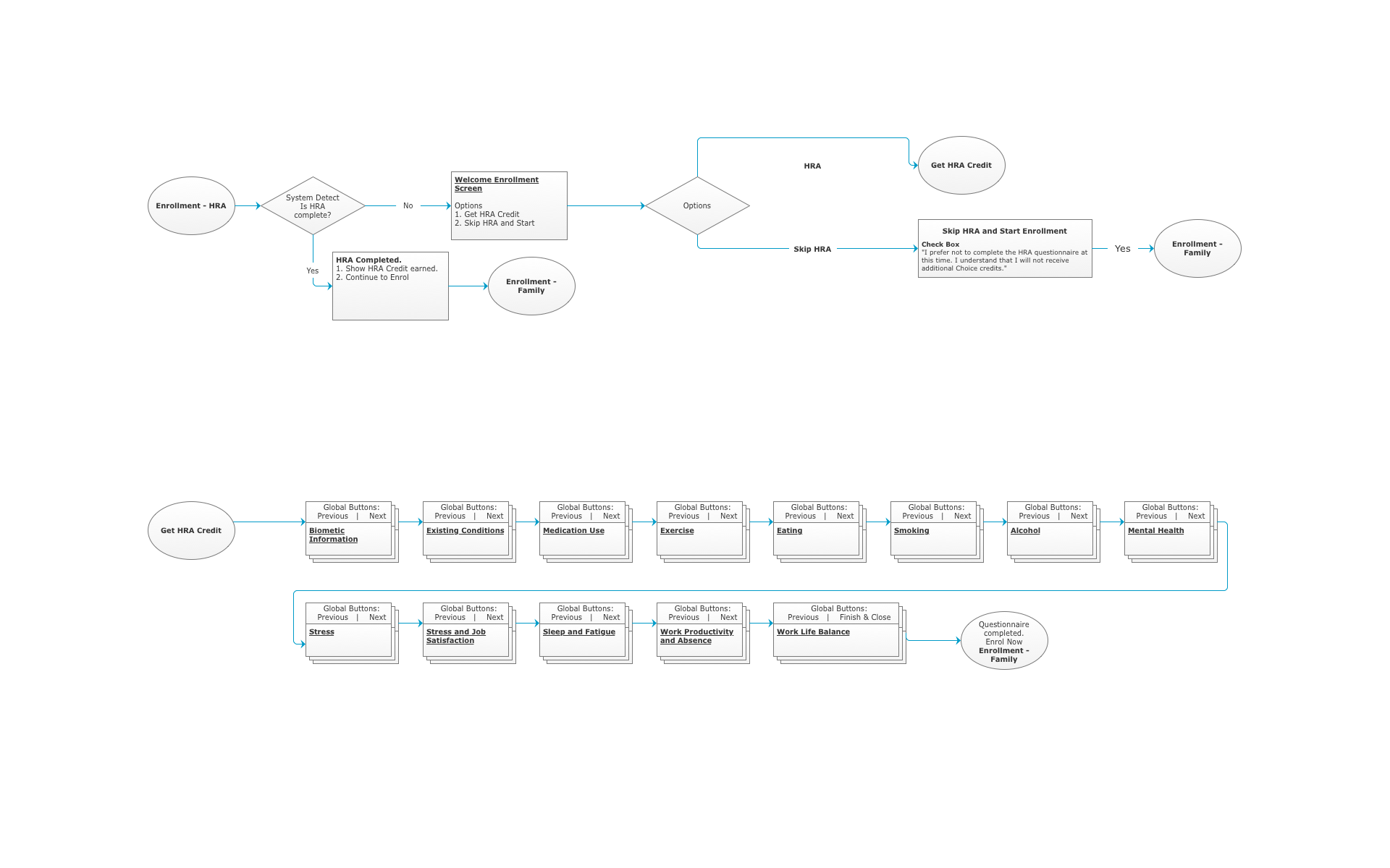
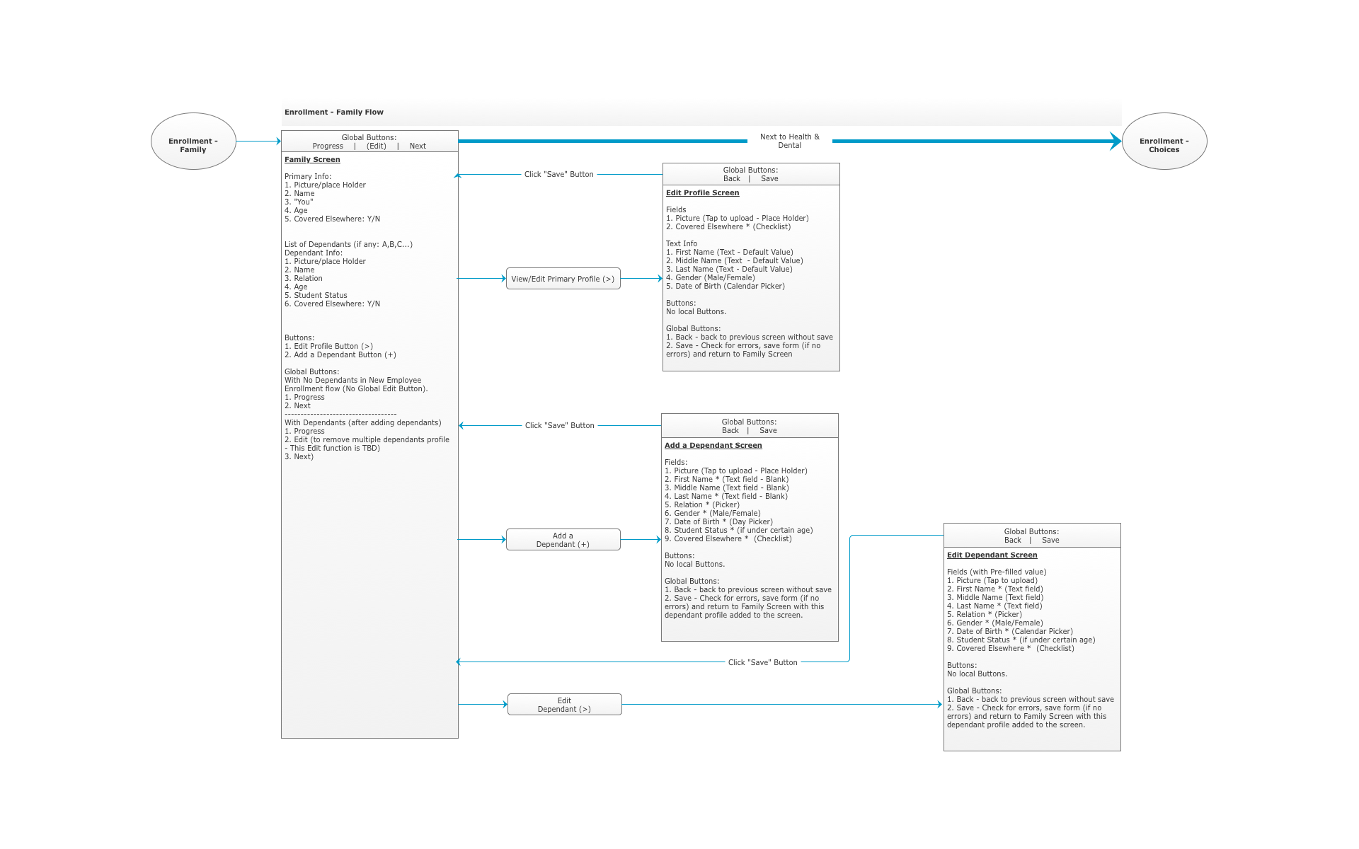
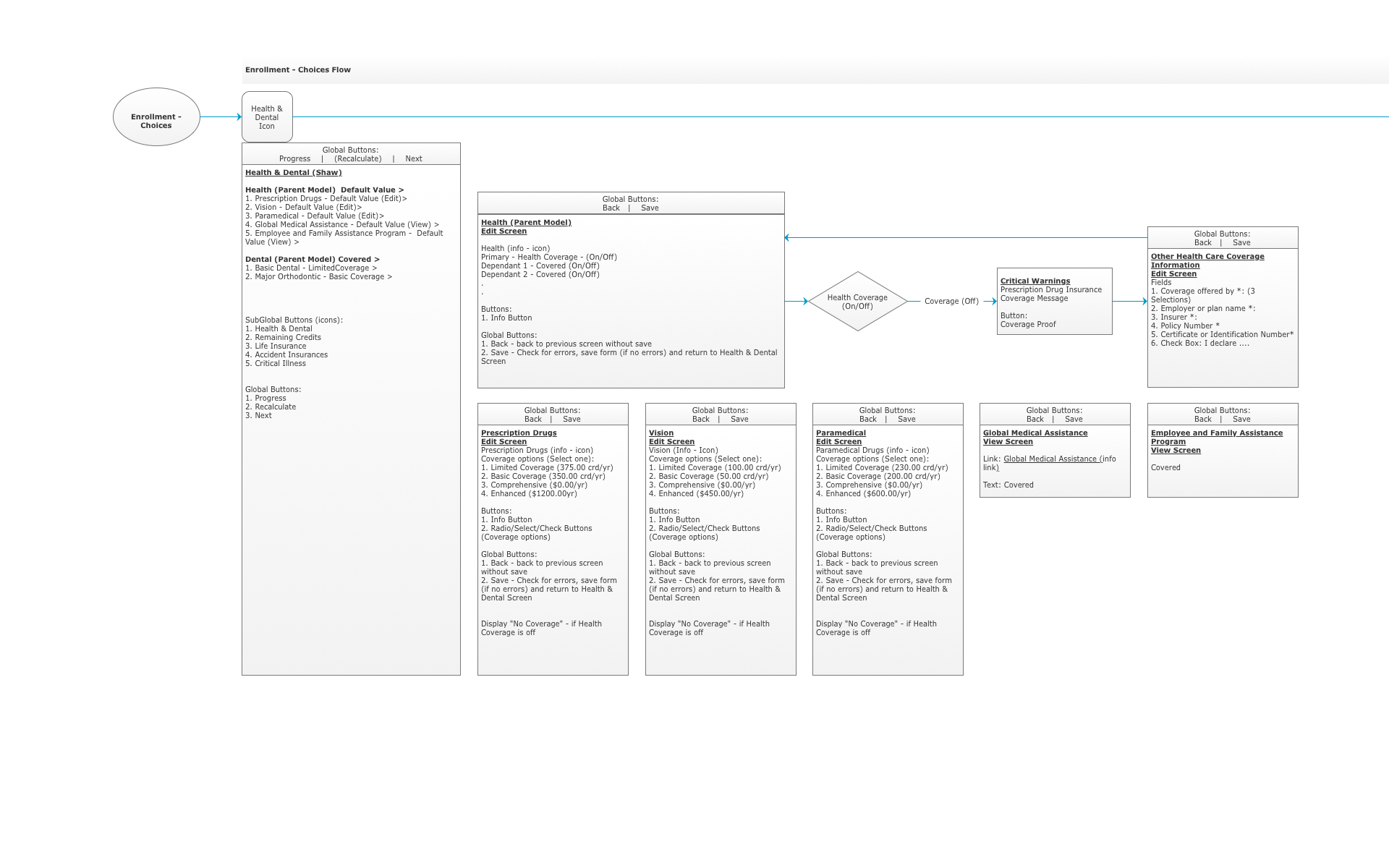
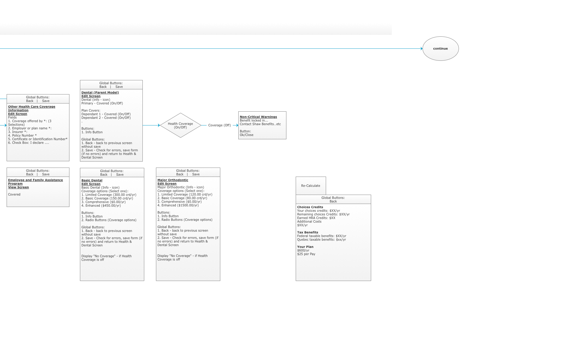
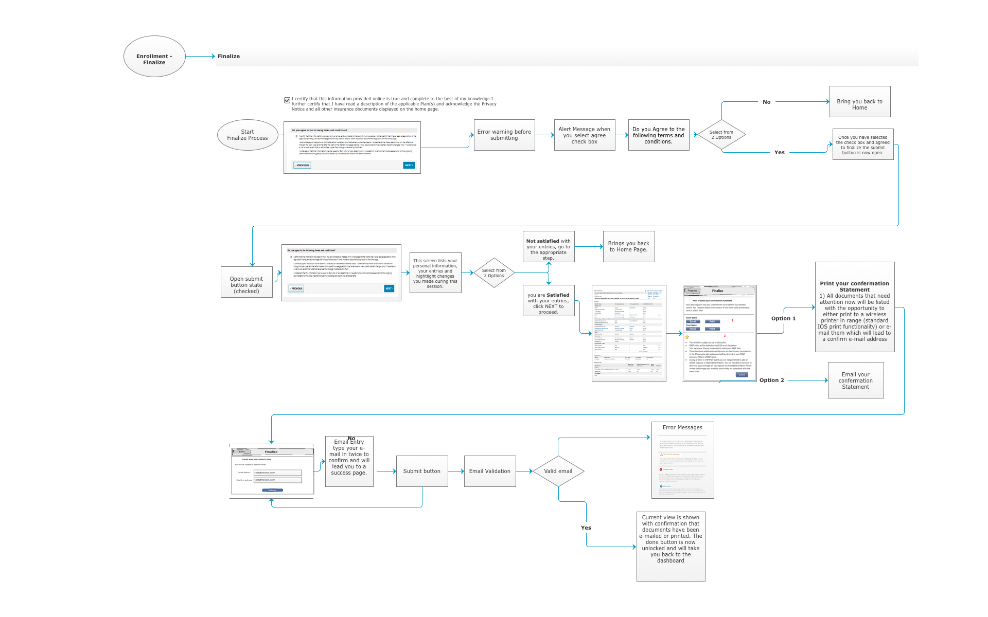
The process of enrolling in employee benefits can be daunting and confusing, but with the help of a mobile application, it can be made much simpler. This flow diagram illustrates the step-by-step process of enrolling in benefits through a mobile app.
Wireframing for Successful Mobile Design
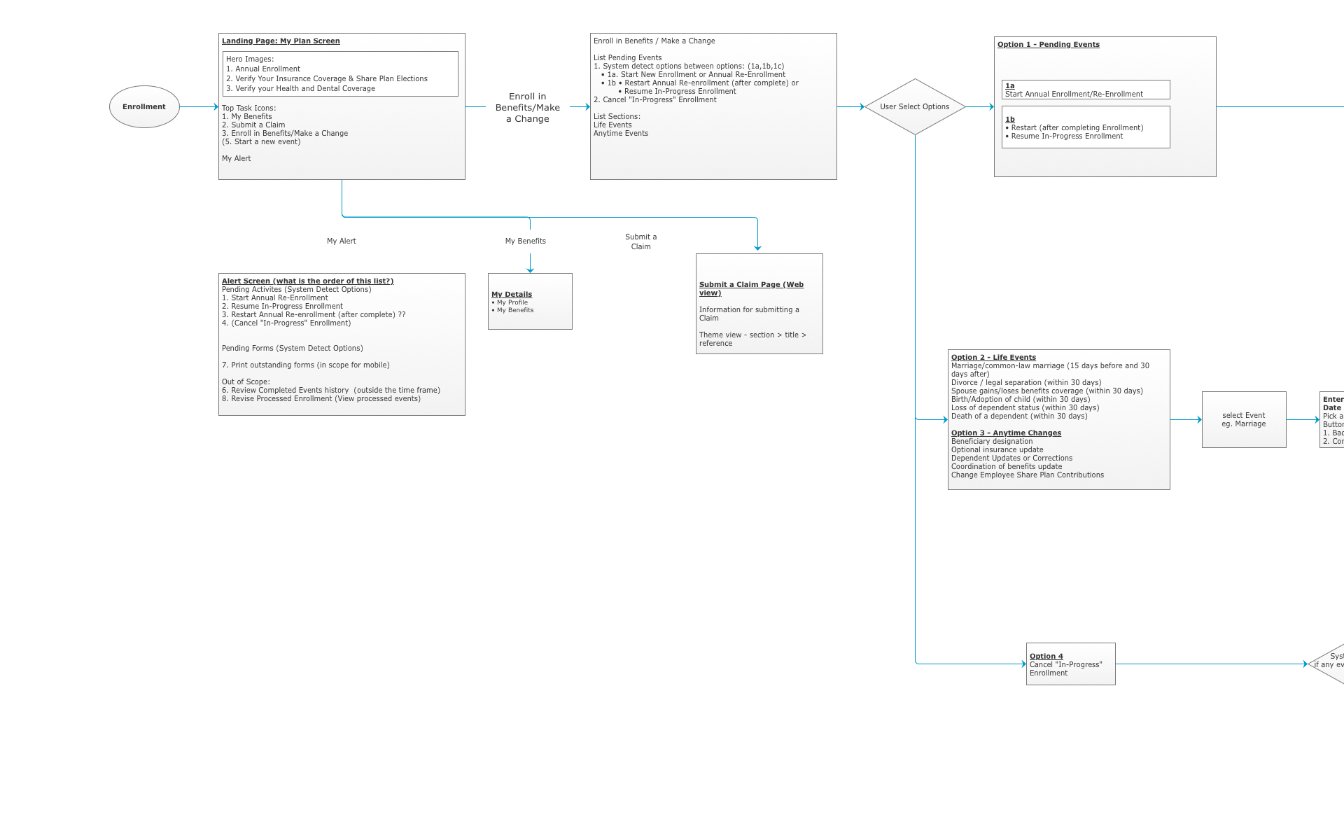
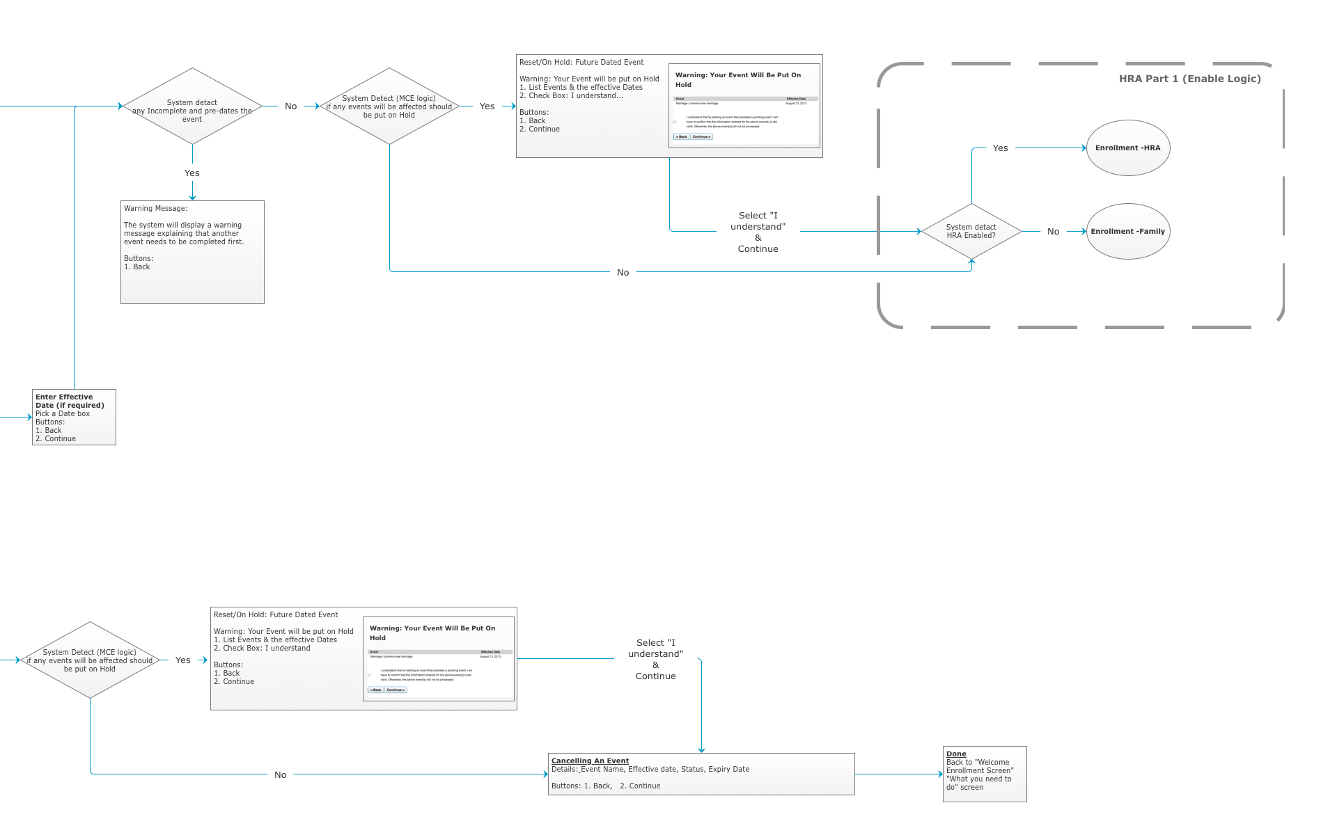
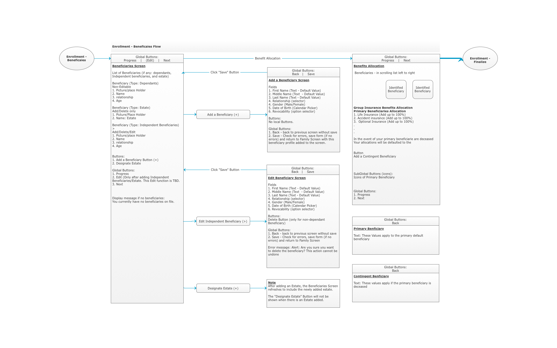
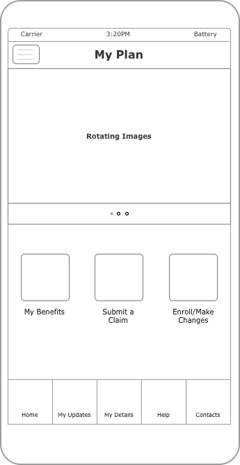
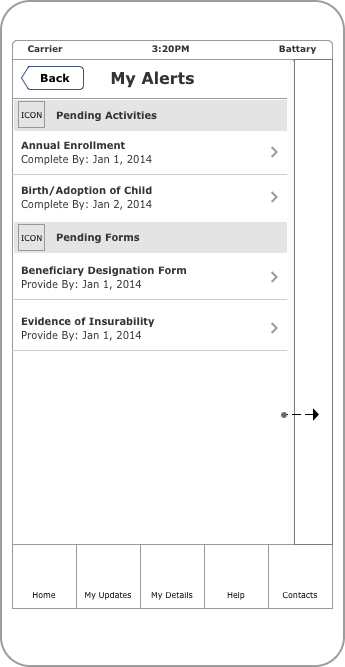
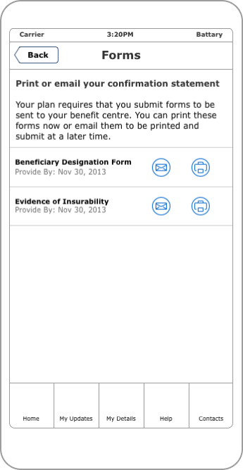
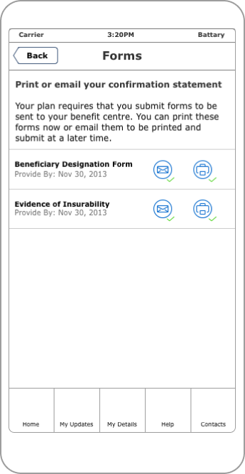
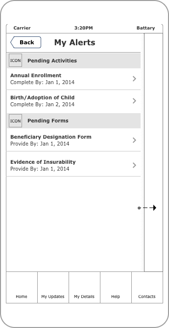
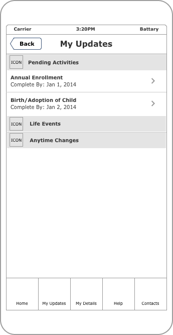
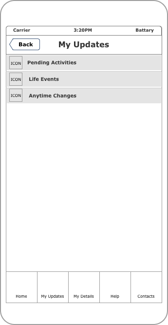
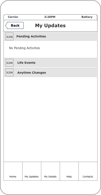
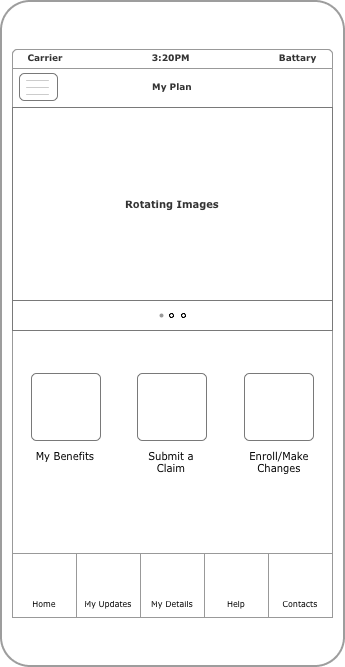
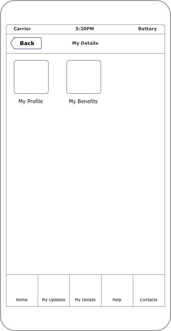
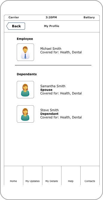
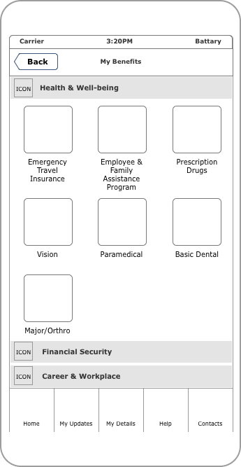
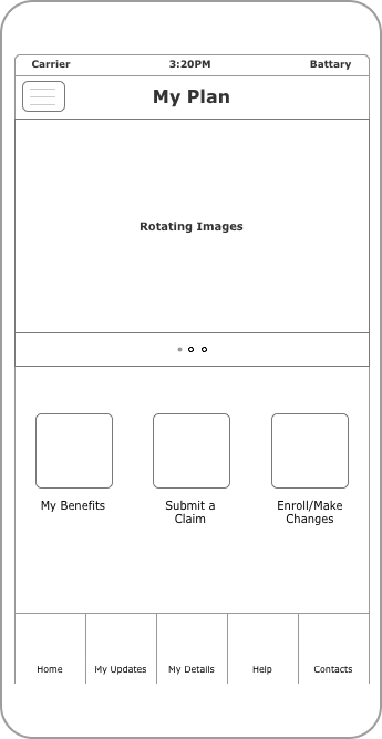
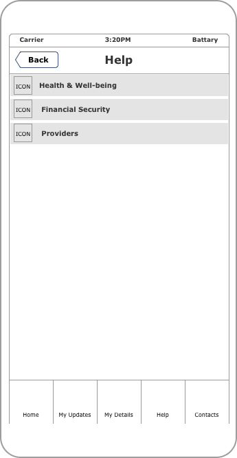
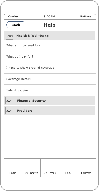
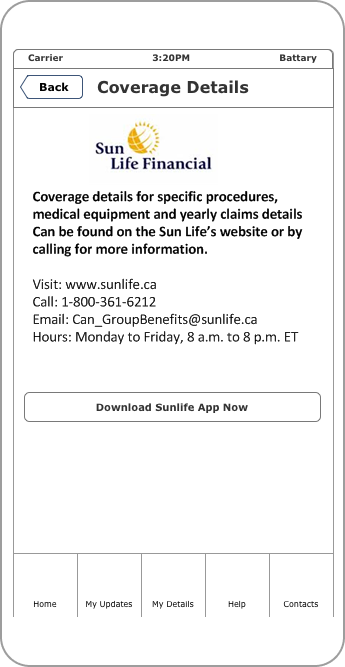
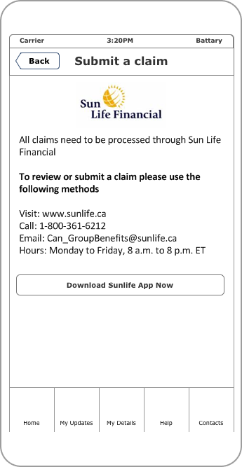
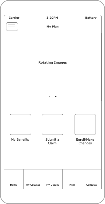
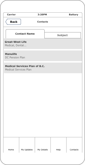
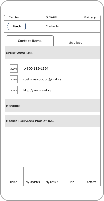
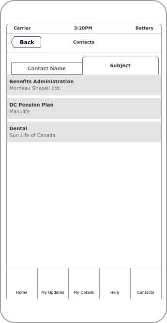
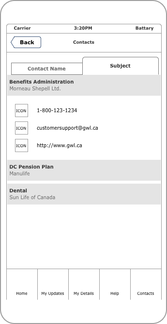
These wireframes are the blueprint for the design of our mobile application. They outline the user’s journey through the application and provide detailed structure and functionality of each screen. By doing so, they ensure a clear understanding of the user interface design, making it easier for us to create a successful and user-friendly website or application. The wireframes served as a foundation for the preparation of high-fidelity mockups, and they facilitated design decisions throughout the process.
Developing high-fidelity mockups: Bringing wireframes to life
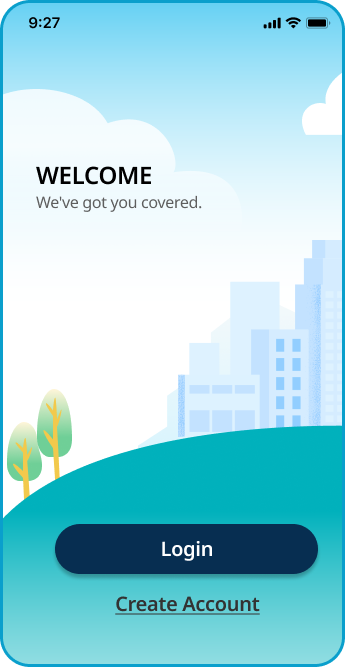
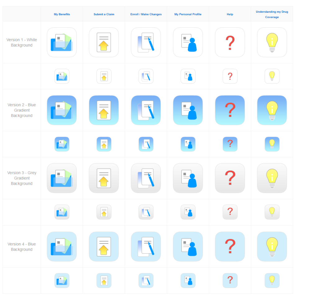
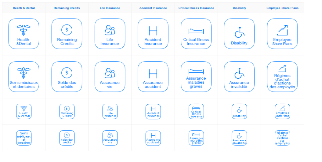
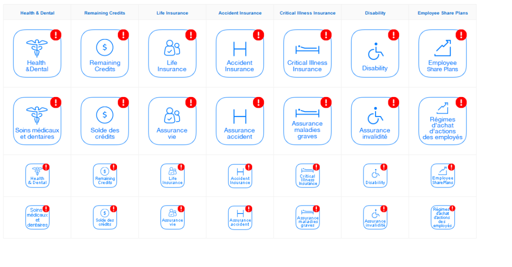
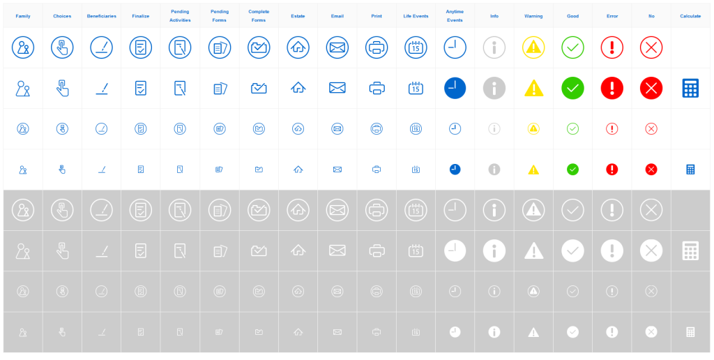
After creating the wireframes, I moved on to developing high-fidelity mockups, which are detailed visual representations of the final product. These mockups are prepared to provide a clear and accurate representation of the user interface design that developers can use as a reference during the development process. Below, you will find a sample page, which is a representative example of one of the pages in the application, as well as a few icons that have been designed for and used throughout the application.
